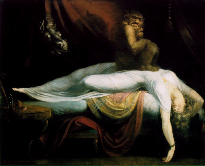
The Nightmare, 1781
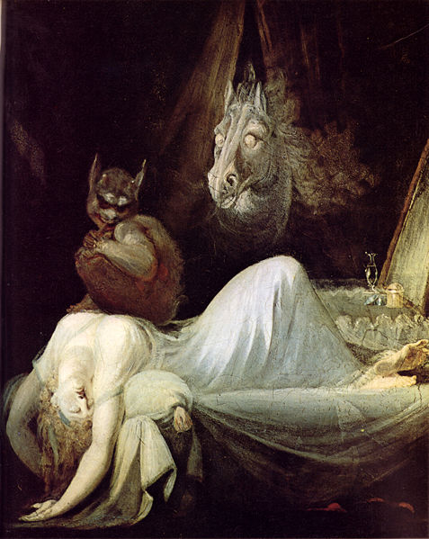
I first saw “The Nightmare”, after Henri Fuseli while in high-school in a book titled, “Images Of Horror And Fantasy” by Gert Stiff. It had a small black and white leaflet of Fuseli’s first version done in 1781 and large color plate of his second version finished in 1791. But it wasn’t until I was in college that I wanted to use “The Nightmare” as a subject for a cubism assignment in painting class, but passed up the idea until last year 2011.
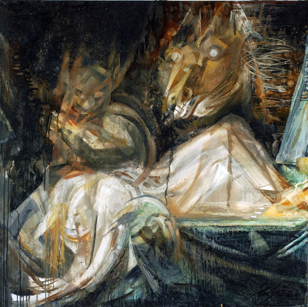
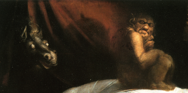
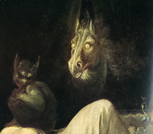
I referenced both of Fuseil’s paintings, as well as read about the history behind him and “The Nightmare”. I primarily used 1790-91 version for reference because of how he depicted the horse and Incubus. Granted all of them are creepy, but there seems to be something more malicious in the way he painted the figures in the 1791 version compared to the 1781 version.
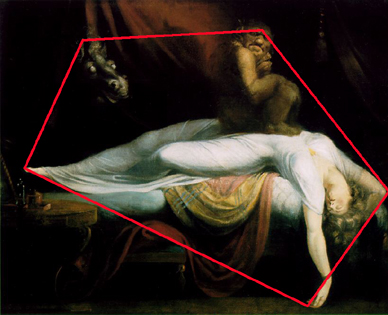
One thing I’ve been intrigued with all these years, aside from the subject itself, is his composition. The way my eyes move around each painting in a circular or triangular motion, between the woman, the incubus, and the horse. The composition has interested me for so long, that before writing this, I decide to use a photo editing tool to draw lines between prominent points on each character to see how my eyes “read” the painting.
pentagram , which I find coincidental considering the subject. I like to analyze masterpieces for a better understanding of them , especially if I plan to do an interpretation of one.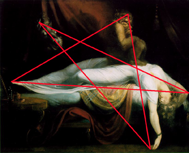
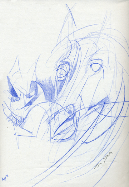
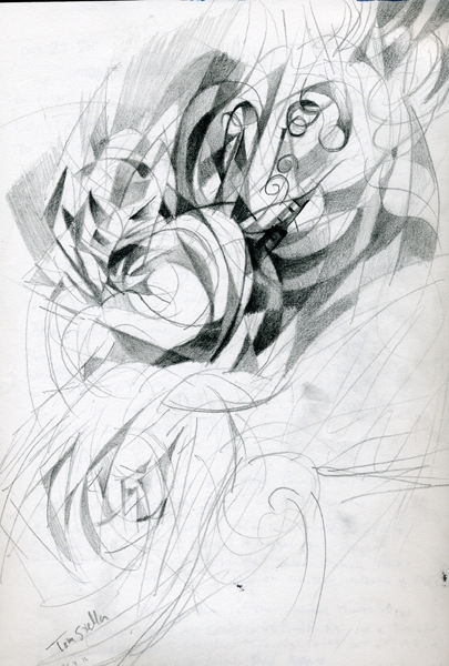
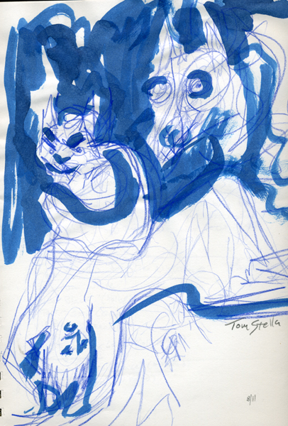
I started preliminary drawings in August of 2011, which I didn’t develop very far before beginning the canvas in early October, below are the studies I did.
My pallet consisted of eight colors, Titanium White, Blue-Black (Holbein), Torrit Grey (Gamblin), Viridian Green, Yellow Ocher, Italian Brown Pink Lake (Old Holland), Old Holland Red Gold Lake (Old Holland) and Golden Barok Red (Old Holland).
The shape of the canvas was decided out of convenience. Normally I build my own stretchers, but I was at an arts supply stare and eager to start the painting that day. Most of the canvases were either to big, or to small for what I wanted to do, so I went with a square 36×36 canvas.
Starting with a gestural drawing in oils, I quickly realized how much the composition needed to be altered because of the square dimensions. Each character’s size, and the space they occupied had to be drastically altered. The more I drew it out, the more cramped the canvas became. Flustered, I started wiping out whole areas, and that’s when I decided to combine a drip painting technique I’ve been exploring along with the cubist idea.
My approach then changed to painting the canvas in sections and layers. Once each character’s general size and position was established, in no particular order, I went between drawing and blending with a brush, pooling paint with oils and letting it run, wiping areas out, and incising the surface with a pallet knife. I also splashed thinner into areas wet with oil to create various effects.
The type of oil medium used was “duo aqua oil” made by Holbein. Fortunately at the time I bought the oil medium, I did not read the label until I finished the work, which was a good thing because its drying rate is much faster compared with linseed oil.
The painting was finished just before October 31, 2011.
